Google Image Thumbnails for Organic Results: Case Study
I Checked 9,718 Listings. Here’s What Google Actually Shows.
Thumbnail presence in organic results is hard to measure at scale - so I ran my own test to understand it better: 293 non-branded women's fashion keywords, both devices, two US locations, 9,718 organic listings scanned via API. The short version: mobile gets nearly twice the visual real estate. The longer version is more interesting.
Companion piece: Google Image Thumbnails in Organic - The Technical Reference covers the how - what to implement so Google can actually pull your images. This article covers the what - which keywords, intents, and positions get thumbnails. Part 2 will crawl these domains and analyse what Google is actually pulling.
The numbers below are shaped by the keywords I chose. Different seeds, different patterns, different categories would produce different rates. This is a structured sample of one vertical, not a universal benchmark. Treat it as a directional snapshot - useful for spotting patterns and relative differences, not as ground truth for "what percentage of all Google results have thumbnails."
How I tested this
I built a keyword set using a seed × pattern system: 39 product seeds (leggings, midi dress, blazer, ankle boots - across 9 fashion categories) crossed with 8 search modifier patterns that people type. That's 312 possible combinations, but 19 were dropped - all from the "fit + seed" pattern (e.g. "high waisted blazer", "high waisted ankle boots") where the modifier produces a query nobody actually searches. The remaining 293 keywords all reflect real search behaviour.
The patterns ranged from bare product terms ("leggings") through colour modifiers ("black leggings"), "best" queries ("best leggings"), year-qualified reviews ("best leggings 2026"), outfit styling ("leggings outfit ideas"), and how-to queries ("how to style leggings"). This gave me systematic coverage across four intent groups: product + modifier, product, comparison, and informational.
I hit each keyword against Google's live organic results via the DataForSEO API, running separate mobile and desktop crawls. I ran the full set twice: once geo-locked to the US nationally, then again locked to Los Angeles to check for geo variation.
Combined dataset: 9,718 organic results and 19,968 images catalogued across both locations. The US national numbers (4,823 results, 9,741 images) form the primary analysis. LA data (4,895 results, 10,227 images) is used for the geo comparison section.
Mobile leads
Semrush Sensor data (April 2026) puts image thumbnails at 49% of US desktop SERPs and 71% of mobile across all categories. Shopping is higher: 77% desktop, 88% mobile. So thumbnails aren't rare. But "thumbnails appear a lot" doesn't tell you which keywords get them, which intents trigger them, or how many images Google attaches per listing. That's where it gets more granular.
Across all nine categories and all four intent types in this dataset, mobile serves more thumbnails on average. At the individual pattern level there's one exception - "fit + seed" queries where desktop edges ahead - but the overall direction is consistent.
Mobile gets almost twice the visual real estate
But the thumbnail rate only tells half the story. Among organic results that have thumbnails, count the total images. Across the same 293 keywords, mobile served 6,409 total images where desktop served 3,332. That's 92% more images on mobile than desktop.
What this means visually: mobile displays image strips - multiple product photos in a horizontal scroll - for each listing. Desktop shows fewer images per listing, or a single image. Here's what that looks like in practice:
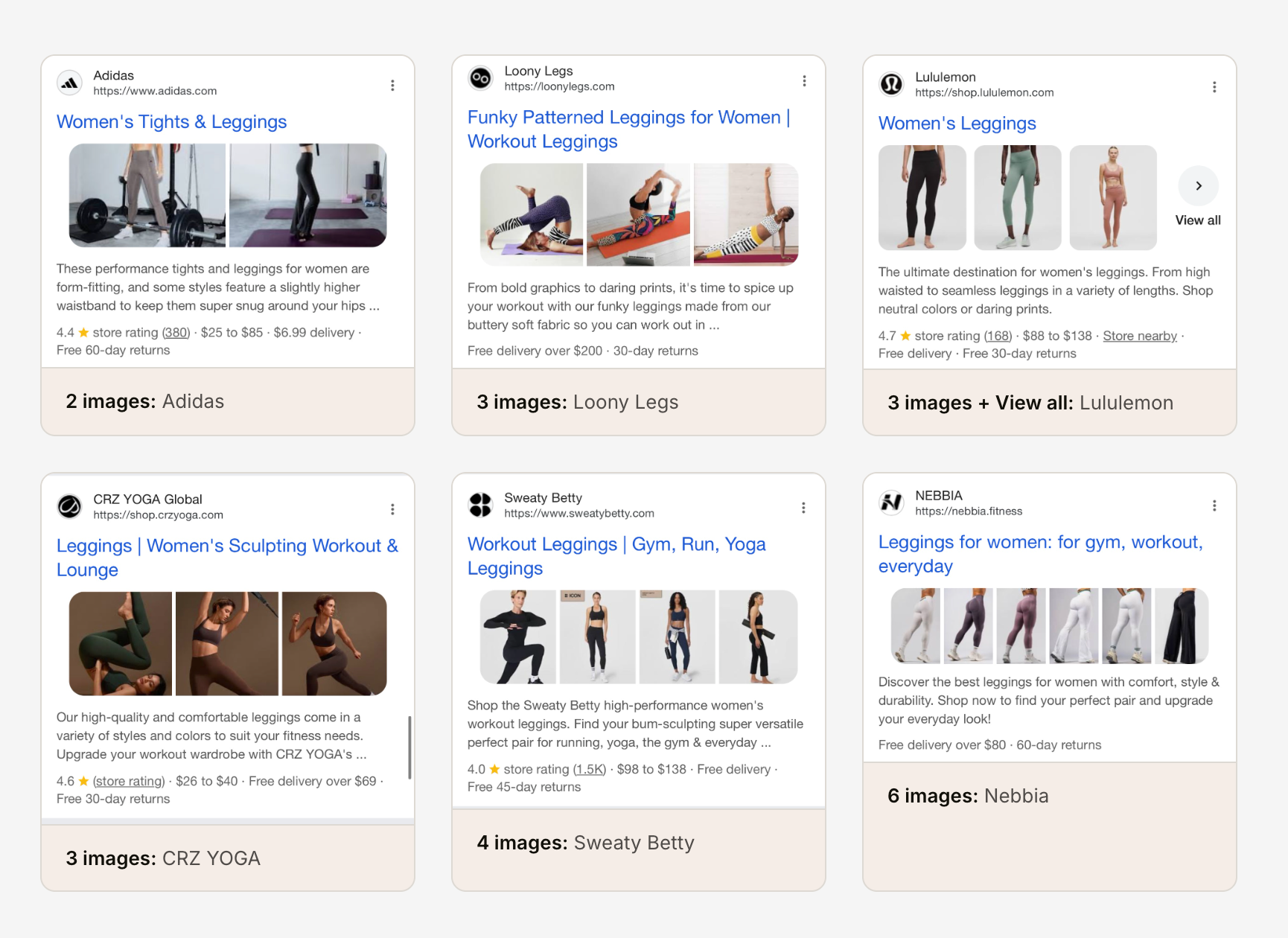
Mobile shows different thumbnail layout options - image strips, individual images, and product variations. Desktop uses a more compact display.
When a mobile listing gets a thumbnail, it gets more images. Desktop shows fewer.
If you're only optimising your product images for desktop, you're missing where most of your visual real estate actually lives.
Search intent changes everything
This is where the pattern-based keyword approach pays off. Because I ran identical product terms through different search modifiers, I can isolate how intent affects thumbnail treatment. I grouped the 8 patterns into four categories based on search behaviour: product + modifier (colour, fit, gender prefix), product (bare seed), comparison ("best" queries), and informational (how-to, outfit ideas).
| Intent Type | Mobile Thumb % | M: Avg Imgs | Desktop Thumb % | D: Avg Imgs | M-D Gap |
|---|---|---|---|---|---|
| Product + Modifier | 83% | 2.93 | 81% | 1.63 | +2pt |
| Product | 81% | 2.80 | 77% | 1.47 | +4pt |
| Comparison | 80% | 2.68 | 60% | 1.10 | +20pt |
| Informational | 70% | 2.39 | 67% | 1.12 | +3pt |
Product + modifier queries - where the search already specifies colour, fit, or gender - lead on both devices. The group averages 83% mobile and 81% desktop across 98 keywords, with the tightest gap of any intent type at just +2pt. When the query is that specific, Google serves a visual SERP on both devices with minimal difference between them.
Comparison queries are where things get interesting. Mobile serves thumbnails at 80% - close to the product groups. But desktop drops to 60%. A 20-point gap from the same keywords.
Informational queries ("how to style leggings", "leggings outfit ideas") sit at 70% mobile - the lowest of any group. These SERPs pull in Pinterest, editorial sites, and social content where thumbnails are shown less often.
Which modifiers move the needle?
The four intent groups tell you what type of query wins. The eight search patterns tell you which specific modifiers make the difference.
| Search Pattern | Example | Mobile % | Desktop % | Gap |
|---|---|---|---|---|
| Colour + seed | black leggings | 86% | 85% | +1pt |
| Gender prefix | women's leggings | 82% | 78% | +4pt |
| Bare seed | leggings | 81% | 77% | +4pt |
| "Best" + seed | best leggings | 80% | 74% | +6pt |
| "Best" + year | best leggings 2026 | 80% | 46% | +34pt |
| Fit + seed | high waisted leggings | 79% | 80% | -1pt |
| How to style | how to style leggings | 73% | 72% | +1pt |
| Outfit ideas | leggings outfit ideas | 67% | 63% | +4pt |
"Best + year" queries drop from 80% on mobile to 46% on desktop. The same keyword, same product - Google just decides desktop users searching "best leggings 2026" want text, not images.
Colour-qualified queries ("black leggings", "black blazer") are the thumbnail champions: 86% mobile, 85% desktop, and the tightest mobile-desktop gap of just 1 point.
The "fit + seed" pattern is the only one where desktop actually beats mobile (80% vs 79%). Queries like "high waisted jeans" signal a specific product attribute that may map well to structured data on desktop product pages.
"Outfit ideas" sits at the bottom with 67% mobile - consistent with the informational intent group trailing across the board.
The pattern across both the intent and modifier tables: the closer a query is to the bottom of the funnel, the more thumbnail listings Google shows - on both devices. Specific product queries lead. Informational queries trail. If your pages target purchase-ready keywords, thumbnails are almost a given. If you're targeting top-of-funnel styling content, expect less visual treatment.
Which categories get the most visual treatment?
Intent and modifier tell you how the query is phrased. Category tells you what the product actually is - and that matters too.
| Category | Mobile % | Desktop % | Gap |
|---|---|---|---|
| Bottoms | 83% | 78% | +5pt |
| Swimwear | 82% | 77% | +5pt |
| Knitwear & Loungewear | 81% | 71% | +10pt |
| Footwear | 80% | 69% | +11pt |
| Outerwear | 79% | 74% | +5pt |
| Activewear | 78% | 67% | +11pt |
| Tops | 76% | 65% | +11pt |
| Dresses | 76% | 74% | +2pt |
| Denim | 73% | 68% | +5pt |
Bottoms and swimwear lead mobile. But the interesting column is the gap. Tops and activewear have the widest mobile-desktop difference at +11 points each. Dresses have the narrowest at just 2 points - apparently Google treats dress queries as equally visual on both devices.
Position matters - but not how you'd expect
Positions 1 and 2 get the highest thumbnail rates on mobile: 86% and 85% respectively. After that, it drops to a fairly consistent 76-79% for positions 3 through 9.
| Position | Mobile Thumb % | Mobile Avg Imgs | Desktop Thumb % | Desktop Avg Imgs |
|---|---|---|---|---|
| #1 | 86% | 3.02 | 77% | 1.13 |
| #2 | 85% | 2.81 | 80% | 1.40 |
| #3 | 77% | 2.78 | 71% | 1.23 |
| #4 | 76% | 2.48 | 70% | 1.34 |
| #5 | 76% | 2.43 | 68% | 1.37 |
| #6 | 78% | 2.89 | 70% | 1.39 |
| #7 | 77% | 2.66 | 67% | 1.42 |
| #8 | 79% | 2.74 | 68% | 1.37 |
| #9 | 77% | 2.86 | 70% | 1.36 |
| #10 | 78% | 2.31 | 90% | 2.20 |
The interesting finding: the number of images per result doesn't decay with position on mobile. Positions 3 through 9 range from 2.43 to 2.89 images per listing - that's a 0.46 spread across seven positions. Position #5 (2.43) gets fewer images than position #9 (2.86). There's no consistent drop-off.
On mobile, the thumbnail advantage isn't about ranking higher - it's about having images at all. Positions 3-9 all get similar visual treatment.
Desktop tells a different story. Positions 3-9 hover around 67-71% thumbnail rates, meaningfully lower than positions 1-2. Position #10 spikes to 90% on desktop, but that's based on just 40 results - too small to read into. If you're ranking mid-page on desktop without thumbnails, you're a text listing surrounded by visual ones.
Position by intent type
The overall position table mixes all search intents together. Here's what happens when you split it by intent - the patterns are strikingly different.
| Position | Mobile Thumb % | Desktop Thumb % | M-D Gap |
|---|---|---|---|
| #1 | 86% | 77% | +9pt |
| #2 | 85% | 80% | +5pt |
| #3 | 77% | 71% | +6pt |
| #4 | 76% | 70% | +6pt |
| #5 | 76% | 68% | +8pt |
| #6 | 78% | 70% | +8pt |
| #7 | 77% | 67% | +10pt |
| #8 | 79% | 68% | +11pt |
| #9 | 77% | 70% | +7pt |
| #10 | 78% | 90%* | -12pt |
* Position #10 desktop based on 40 results - small sample.
| Position | Mobile % | Desktop % | M-D Gap |
|---|---|---|---|
| #1 | 81% | 78% | +3pt |
| #2 | 91% | 90% | +1pt |
| #3 | 83% | 84% | -1pt |
| #4 | 82% | 83% | -1pt |
| #5 | 84% | 81% | +3pt |
| #6 | 82% | 81% | +1pt |
| #7 | 84% | 76% | +8pt |
| #8 | 82% | 75% | +7pt |
| #9 | 74%(62) | 81%(79) | -7pt |
| #10 | 75%(16) | 91%(23) | -16pt |
98 keywords. Numbers in parentheses = keyword count where fewer than 98 returned results at that position.
| Position | Mobile % | Desktop % | M-D Gap |
|---|---|---|---|
| #1 | 87% | 79% | +8pt |
| #2 | 85% | 87% | -2pt |
| #3 | 87% | 85% | +2pt |
| #4 | 87% | 72% | +15pt |
| #5 | 77% | 79% | -2pt |
| #6 | 79% | 72% | +7pt |
| #7 | 72% | 79% | -7pt |
| #8 | 73%(37) | 68%(38) | +5pt |
| #9 | 82%(28) | 59%(29) | +23pt |
| #10 | 75%(4) | 100%(6) | - |
39 keywords. Positions 8-10 have reduced samples. Position #10 too small to interpret reliably.
| Position | Mobile % | Desktop % | M-D Gap |
|---|---|---|---|
| #1 | 87% | 64% | +23pt |
| #2 | 87% | 67% | +20pt |
| #3 | 82% | 55% | +27pt |
| #4 | 72% | 59% | +13pt |
| #5 | 81% | 55% | +26pt |
| #6 | 78% | 60% | +18pt |
| #7 | 76% | 62% | +14pt |
| #8 | 81%(64) | 62%(73) | +19pt |
| #9 | 79%(29) | 57%(51) | +22pt |
| #10 | 100%(8) | 82%(11) | - |
78 keywords. Desktop consistently 13-27 points below mobile at every position. Position #10 too small to interpret.
| Position | Mobile % | Desktop % | M-D Gap |
|---|---|---|---|
| #1 | 90% | 88% | +2pt |
| #2 | 74% | 76% | -2pt |
| #3 | 62% | 63% | -1pt |
| #4 | 67% | 64% | +3pt |
| #5 | 62%(76) | 60% | +2pt |
| #6 | 69%(59) | 64%(77) | +5pt |
| #7 | 62%(32) | 52%(61) | +10pt |
| #8 | 69%(13) | 60%(30) | +9pt |
| #9 | 78%(9) | 83%(6) | - |
| #10 | 50%(4) | - | - |
78 keywords. Informational SERPs are shorter - many keywords return fewer than 10 organic results. Positions 7+ have very small samples.
The comparison tab is the standout. Mobile thumbnail rates stay above 70% at every position, while desktop hovers around 55-65%. That 20-point intent gap from the summary table isn't a quirk of averaging - it's consistent across every SERP position.
Informational queries tell a different story: position #1 dominates at ~90% on both devices, then drops steeply. By position #3, you're already below 63%. If you're ranking third for "how to style leggings," the thumbnail odds are basically a coin flip.
Product + modifier queries are the most stable - 75-91% across all positions on both devices, with barely any mobile-desktop gap until position #7.
What the data is actually telling you
Thumbnails aren't a bonus feature. At 80-85% of organic listings for product queries, they're the baseline. Your page isn't competing to earn a thumbnail - it's failing to keep one.
The position data makes this concrete. Positions 3-9 on mobile get roughly the same image treatment - a 0.45-image spread across seven positions. A competitor at #7 with a thumbnail looks visually equivalent to you at #3 without one. Google isn't amplifying your ranking advantage. It's flattening it.
The cost is highest where it matters most. Colour + product queries hit 86% mobile thumbnail rate. These are purchase-intent searches - people comparing products before they click. Being a text result next to an image grid at a lower position is a bad trade at exactly the wrong moment.
One place where this flips: comparison queries on desktop drop to 60%. Less than two-thirds of listings have images. "Best [product] 2026" on desktop is one of the few places where getting thumbnails right is a genuine differentiator - not just keeping pace.
Being text-only in a visual SERP isn't neutral. It's a gift to everyone around you.
Who's winning the thumbnail game?
Not who you'd expect. And it looks different depending on the device.
Mobile
| Domain | Appearances | Thumb Rate | Avg Position | Avg Imgs/Thumb |
|---|---|---|---|---|
| nordstrom.com | 65 | 98% | 4.4 | 5.2 |
| macys.com | 71 | 96% | 5.2 | 4.9 |
| hm.com | 48 | 94% | 4.4 | 1.7 |
| asos.com | 29 | 93% | 5.5 | 4.1 |
| vogue.com | 67 | 93% | 4.3 | 2.7 |
| instyle.com | 37 | 92% | 4.0 | 3.4 |
| glamour.com | 33 | 88% | 4.1 | 4.0 |
| anthropologie.com | 28 | 82% | 5.4 | 3.7 |
| abercrombie.com | 34 | 79% | 4.4 | 4.4 |
| express.com | 41 | 78% | 3.9 | 4.2 |
| whowhatwear.com | 68 | 74% | 4.0 | 4.0 |
| amazon.com | 137 | 73% | 3.9 | 2.8 |
| pinterest.com | 164 | 54% | 3.5 | 3.7 |
| reddit.com | 102 | 16% | 4.8 | 1.0 |
Desktop
| Domain | Appearances | Thumb Rate | Avg Position | Avg Imgs/Thumb |
|---|---|---|---|---|
| hm.com | 52 | 92% | 4.8 | 1.0 |
| macys.com | 73 | 90% | 5.3 | 1.7 |
| nordstrom.com | 69 | 88% | 4.5 | 1.6 |
| abercrombie.com | 33 | 79% | 4.7 | 1.4 |
| instyle.com | 43 | 77% | 4.5 | 2.9 |
| vogue.com | 63 | 75% | 4.0 | 1.7 |
| express.com | 45 | 71% | 4.0 | 1.5 |
| amazon.com | 137 | 68% | 4.2 | 2.3 |
| glamour.com | 37 | 68% | 4.5 | 2.3 |
| anthropologie.com | 31 | 65% | 5.5 | 1.0 |
| whowhatwear.com | 71 | 62% | 4.2 | 2.4 |
| pinterest.com | 169 | 51% | 3.8 | 1.0 |
| reddit.com | 101 | 24% | 5.0 | 1.0 |
| youtube.com | 35 | 0% | 6.6 | 0.0 |
Nordstrom leads mobile at 98% with the richest image treatment - 5.2 images per thumbnail result. Macy's is close behind at 96%. On desktop, H&M takes the top spot at 92%, though with just 1.0 image per thumbnail. The image counts drop across the board on desktop - Nordstrom goes from 5.2 to 1.6, Macy's from 4.9 to 1.7.
Note: themomedit.com (27 mobile, 30 desktop appearances) and asos.com (29 mobile, 26 desktop) both have small sample sizes. Their rates - themomedit.com at 100%/90%, asos.com at 93%/88% - are directionally interesting but shouldn't be weighted equally with domains that appear 60+ times.
Pinterest ranks highest by appearances on both devices but only shows thumbnails around half the time. It gets the real estate. It doesn't always get the visual treatment.
Reddit sits at 16% mobile, 24% desktop. YouTube: 0% on desktop (35 appearances). Google doesn't serve video thumbnails in standard organic results for fashion queries - those live in the video carousel.
Amazon sits at 73% mobile, 68% desktop - surprisingly low for the world's largest online retailer. Nordstrom and Macy's get images on 96-98% of their mobile appearances. Same keywords, same intent, meaningfully different implementation.
Does location matter?
The LA scan returned 4,895 organic results (vs 4,823 for US national) and 10,227 images (vs 9,741). Slightly more results and more images - LA's retail-dense market surfaces a marginally richer SERP.
But on the thumbnail rates themselves: not much difference on mobile. LA mobile thumbnail rates are within ±5 points of national for every category. Desktop shows slightly more variation - Footwear in LA is 6.4 points higher than national, Swimwear 5.5 points higher. This likely reflects LA's local retail ecosystem surfacing different merchant results on desktop.
The overall rates: LA mobile 79% vs US national 79%. LA desktop 74% vs US national 72%. Close enough that running a single national crawl gives you representative data for most purposes. If you're doing client work for a brand with strong local presence, city-level targeting is worth running separately.
What actually triggers a thumbnail?
The SERP data tells me who gets thumbnails and who doesn't. It doesn't tell me why. Nordstrom at 98% mobile and Amazon at 73% - on the same keywords, same intent - there's clearly something different about their image implementation. But what exactly? That's coming in Part 3: qualitative thumbnail research.
This is where the technical reference picks up. The short answer: Google needs to find your images, trust them, and match them to the query. That means real <img> elements in the HTML (not CSS backgrounds), images that don't depend on JavaScript to render, proper og:image and Product schema pointing to high-quality photos, max-image-preview:large in your robots meta, and descriptive alt text. Miss any of these and you're invisible - even if the page looks image-rich to a human.
The multi-image treatment (the horizontal strip of product images) is harder to trigger. Schema isn't the deciding factor. CMS doesn't matter. What matters is having 7+ relevant, indexable product images early in the HTML, each showing a single product on a non-transparent background. I'm running a separate case study measuring schema presence against the multi-image treatment across e-commerce verticals.
The full technical breakdown - HTML layer, JS rendering issues, responsive image fallbacks, format requirements, alt text quality, and the multi-image treatment - is in Google Image Thumbnails in Organic - The Technical Reference.
What to do with this
The data tells you where thumbnails show up. It doesn't tell you how to get them. That's implementation, and it's all on your side.
Start with mobile. This dataset served 92% more images on mobile than desktop across the same 293 keywords. If your mobile product pages ship smaller images, fewer of them, or heavier lazy-loading than desktop - that's where you're losing the most visual real estate. Not the hero. Not the metadata. The product imagery itself.
Then the robots meta. max-image-preview:none turns thumbnails off. standard - or leaving the tag out - is the default: standard-size previews, no more. large is what unlocks full-width previews and the multi-image strip. If you're running standard because that's what the CMS shipped with, you're capping yourself below what Google would actually show. Five-minute check.
Then og:image. If your og:image is a logo or placeholder, Google is more likely to skip showing thumbnails entirely if there is no strong product image on the page. A logo-default og:image signals weak visual content, and Google treats it as a reason not to surface images. If your CMS stamps the brand logo into every product page's og:image, swap it for the primary product photo. Perhaps one-line config, significant impact.
For the full technical checklist - HTML requirements, JS rendering, responsive images, the multi-image treatment - see the technical reference.
Data collected April 2026 via DataForSEO Live Advanced API. 293 non-branded keywords × 2 devices × 2 locations. 9 women's fashion categories, 8 search patterns, 4 intent groups (product + modifier, product, comparison, informational). 312 possible keyword combinations; 19 dropped from the "fit + seed" pattern where the modifier produced queries nobody actually searches. US national: 4,823 organic listings, 9,741 images. Los Angeles: 4,895 organic listings, 10,227 images.
On "US national": DataForSEO uses Google's Geographical Targeting system. Setting the location to "United States" (location code 2840) does not return a national average - it returns what Google serves to a user whose location signal is the US with no specific city. Think of it as a non-localised US SERP rather than an aggregation across cities. The LA crawl used city-level targeting, which introduces local retail and geo-specific ranking signals. The two datasets are not a national average vs a city sample - they're two different location signals producing two different SERPs.
Thumbnail presence determined by the images array in DataForSEO's organic result objects. Image counts reflect the number of image elements associated with each organic listing, not the total images on the destination page. The headline thumbnail rates (79% mobile, 72% desktop) are per-listing counts - total results with thumbnails divided by total results. Category, pattern, and intent breakdowns use per-keyword averages, giving each keyword equal weight regardless of how many organic results it returned. Full dataset available on request.